What is Marple?
Marple is a web-based data visualization and analysis suite for engineering teams. We specialize in time-series data from complex dynamic systems such as aerospace prototypes, automotive testing rigs or simulations.
Data can be easily imported into Marple and from there, it’s readily available to the whole team, much like your everyday cloud collaboration service. We then offer a very engineering-focused plotting experience that has been curated by our own experience of working in large engineering teams and from feedback from Marple users.
Building from that base, we’ve added additional analysis and reporting features that make Marple a robust and powerful all-round tool, whilst still being lean and smart all with a no-vendor-locking policy.
These things couldn’t be achieved without Marple’s core, which at its most fundamental is a data treatment engine, allowing for performant plotting and querying, often considerably faster than other tools in the area.
Could you explain how the remote accessibility offered by Marple is useful to test engineers?
Engineers go to work on demanding and exciting projects, they may not have the time to stay in touch with the latest workflow optimizations.
We often see teams using tools over 15 years old — but adapted to today’s needs. This leaves us with a lot of screenshot-sending over email, files shared insecurely (and named _final_final_…) and an overall disjointed team flow.
Cloud technology is now at a point where enterprise users can harvest their power, ease of use and low cost so it made sense for us to make this one of our core offerings.
From rolling updates, which has never been easier, to sharing a common language with other tools or your IT team, the web environment brings a myriad of possibilities for improving your everyday massively.
How does Marple help address the challenges faced by aerospace engineers?
In a complex system, teams will often end up with large piles of data – not information. If a team wishes to explore the small picture of a dataset, say Angle of Attack during the first six seconds of a stall test, they may code and debug a script to produce a quick plot, then screenshot it, paste it in another tool, and so on. It is a cumbersome process.
With Marple, data is uploaded just once and the team can build signals on top using our built-in calculator, overlay similar runs, share an interactive plot to PowerPoint or other tools for smarter write-ups and much more.
On the other hand, if a team wishes to explore the big picture of a set of tests, say engine temps over 1,000 take-off runs, instead of scripting repeatedly Marple can batch-upload thousands of files at once and produce trend analysis with criteria selected in just a few clicks.

How does Marple ensure both flexibility and speed in processing data?
Under the hood, Marple has a smart sampling algorithm (read more about it in our blog!). Essentially, when you display many data points, software can struggle to render all of them at once. However, you can present a smaller subset of equally meaningful points that will be easier to render.
But a lot of thought has to be put into this – how to prepare and chunk the data, when and how to identify those meaningful points, and so on. We’ve managed to optimize this and we have some amazing numbers to show off – up to 1GHz support and single files weighing up to 30GB.
Similarly, for the file formats, support is wide but also strict, we even have an import wizard which will highlight any deficiencies when importing data.
How does Marple’s user interface align with the complex nature of engineering data analysis?
I always like to compare Marple to a plane’s cockpit – immensely complex and thorough but with a hyperfunctional design. The design is to make fundamental building blocks that when joined together allow for specific procedures to be carried out.
We wanted to do this with Marple’s interface. We focused on understanding the core building blocks of a powerful analysis workflow and how to present them to a user in as few clicks as possible.
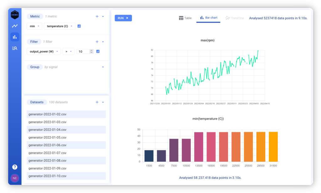
For example, a user can query 50 million data points from across 100 tests in around 3 seconds to understand an important metric – performance output when under a certain temperature. Then spot a non-performing test, and then start building plots around that test to get a better sense of what’s going on. This isn’t a single button, but rather 4 or 5 different key components of Marple merged together.
What improvements can users expect in the next version of the software?
Marple is composed of a visualizer, allowing you to create your own spaces using time-series plots, map plots, FFT plots or scatter plots. This area has creative tooling, it allows an engineer to quickly view different angles, applying different tweaks to better understand their data. You can expect us to continue taking feedback to make this more and more intuitive this coming year.
We recently added a Test Reporter, allowing you to create pass/fail criteria for batches of tests. This feature integrates well with our existing toolset because an engineer can then go back and analyze whatever test failed in depth. This will also see some upgrades, as it’s the latest addition to our suite and we are still actively hearing out from teams using it.
Last year, we pushed a Marple update every 13 days on average and that’s thanks to our well-maintained codebase and our talented development team!
Find more information on Marple here


